I have been researching different idents to get a feel for the ident I would like to use. I will discuss the sound/movement/image/name of the idents and decide wether I like them.
My first example is an ident from the company Perceptireel Pictures.
http://www.youtube.com/watch?v=qLg5NzRYLQs
This ident is interesting because of its feeling of "ruggidness". The grainy effect and the images being quite smudged make the ident seem rather gritty. Moreover the rubix cube idea is great because it makes alot of action which is surprisingly simple to concentrate on, the images which play on the rubix cube relate to the company which is about images and films hence the eye and the reel being the main focus of the images on the rubix cube. Also the colour scheme is black and white, this makes the image simpler and the audience are more receptive to it. The music for this ident is good because it is powerful but low key keeping the viewer interested in the actions. Finally i like the name because it is a play on words, the word perceptireel is a mixture of perception, real and reel which I find clever and I quite like in an Ident name.
Next i would like to discuss The Weinstein Company ident.
http://www.youtube.com/watch?v=mRVh_8y2CAQ
This ident is shorter than the Perceptireel pictures ident, I prefer the ident being shorter as people might get bored looking at an ident. However the weinstein company is not only shorter but much simpler, it starts by making three downward shaped triangles appearing in descending order. Then the name of the company appears, the simple colour scheme is great because it means the audience is not going to have to concentrate too hard. The sound is gentle and uplifting which promotes the weinstein company in a positive way and gradually crescendos till the end of the animation.
An ident that I dislike is the Island Pictures animation.
I do not like the island picutres animation because it does not seem to have any correlation with the title name. Admittedly it is abstract and I do quite like that aspect of it but i feel it should be abstract within boundaries, however the randomness i find there is too much colour and you have to strain to watch the ident. A positive aspect of this ident is the music, it is slow and melodic which has a nice ambience and makes the audience relax.
In conclusion, I would like my ident to be simple and short. This is because i don't want to overdo the atmosphere and the ident should be memorable but not too imposing. Moreover I would like to make minimal movement so the viewers do not need to focus too hard.
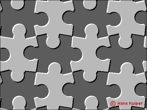
To achieve this I would like to make my ident in black and white, an example of this would be the Weinstein company's ident. I like the simplicity in colour as opposed to that of the Island Pictures, there is a large contrast between the two idents and I would be worried that I go too overboard with an ident similar to Island Pictures animation. For Movement, I think that movement is key but it must be subtle and slow. The rubix cube is a smart idea however it is too powerful or bold. I would like to use a some shapes and maybe just move them, maybe create a tessellating pattern like -
This will be simple and inspiring, for the name of the company I like to have a clever play on words much like the first example of perceptireel pictures another good example of this is an independent company called layZeye, this type of idea is interesting and engaging. Music wise I firmly believe that the music should be empowering of sort, the weinstein company have very uplifting and motivational music which i believe promotes the ident greatly. However the island pictures music is soft and quiet which can possibly be used to their advantage.