Monday 16 December 2013

Graphics: Planning


For end credits, we would like a dense cluster of the words to present the information, because following the dramatic montage of the trailer's third act, the credits should appear on screen in a 'hard and fast' style that delivers all the essential information in one go. Our trailer will probably start off fairly ambient and visuals based, but will gradually become more concise as it crosses over into Act 2 and Act 3 of the Three Act Structure of the trailer (the establishment of conflict and the final montage), and so the clear, block credits will be the final burst of information following the title shot.


Film Title: Influences


Inspiration can be drawn from Manhunt: The Search for Bin Laden, with its separating the stylisation of two sections of one word; this places emphasis on its meaning and leads the audience to question why the title was chosen and how it is important. In this case, 'manhunt' is familiar term with sinister connotations, but in the case the hunted is the 'evil' entity, not the hunter, thereby subverting expectations of what the title implies. Furthermore, the title is so basic and literal in its meaning that it quite simple to understand its premise, and although it may be a touch heavy-handed at least it is simple and direct, avoiding anything complex and pretentious. 
The spacing of the letters is relevant here because the 'Man' in question - Bin Laden - is one obvious issue the CIA are facing in their counter-terrorist activity, present in a tightly-lettered, simplistic form, whilst the 'Hunt' is the bigger, longer process that takes years to resolve, conveyed with the letters spread out across the screen/page.

Tuesday 3 December 2013

Graphics: Influences


'The Act of Killing' has preferably simple and clean font, that was reported to be visually striking by our focus group. The equal spacing between the letters makes the title command the width of the screen and gives it a strong impact. As opposed to something more directional and perhaps artistic, I feel that documentaries benefit from having less flamboyant font because they are focused on telling a real life, investigative and analytical piece, and the graphics should reflect this.


Further inspiration comes from Scandinavian brand
Which has a 'no-frills', simple but effective font, emphasizing the point I made earlier. 
In terms of real examples, 2007 'Control' has similar themes of intertwining struggle and success, as well as being similar to a documentary because it is a biographical film, and its font reflects the style we would like. Furthermore, I like how the grey fade gives it a shadowy depth, that is similar to its neo-noir style. 


The image below shows a similar example of graphics we would hope to use. 


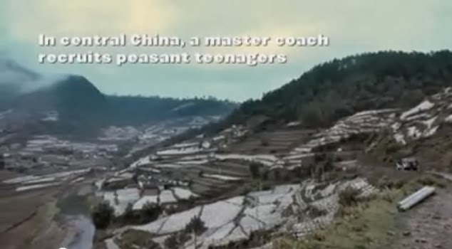
In the example of the "Up in the Air" the fonts is leaning a bit too much towards a 'comic sans' direction that we don't want, but it has a clear spacing on different parts of the screen that highlight establishing shots of the background, which allude to the idea of the central themes being about flying, travel and restlessness. Ideas of restlessness will also play a part in our film, since the central characters are striving to make a transition from their current lives towards their sporting goals, and this suits the shifting structure of the credits and the dynamics against the background.


SL.


Monday 2 December 2013

Film Poster Research


Colour & Tone = Upon first glance, this poster is aesthetically striking because of the contrast of the moody black and grey background lit up by the almost violently bright orange flame. This poster suggests to me that this is a film whose subject matter is dark and gritty, with the explosion of fire against grey skies connoting themes of conflict and perhaps destruction 'overhead'.  Alhough our films subject is not as grim and hopeless as "There Will Be Blood", I like the way colour suggests a variety of (at times) contrasting themes.

Imagery  = Character is established in the left hand side of the poster (immediately influencing our gaze upon the order of the images), and the fact that he has back turned creates a sense of mystery around the individual. Furthermore his  hunched stance upon the chair asks contrasting questions; is he worn out and withdrawn from the chaos he sees before him, or is he about to leap into action. Or both?

Text & Font = The main titles are in the style of calligraphy, and this automatically suggests that this is period film, so thus establishing genre. Our film's font will proabably be a bit more ambigous but still try to deliver a simple message that it is, for example, not a chick flick. There are minimal credits, only the main actor and the writer/director, and our film will probably have a similar lay out because it is a documentary, and so relies less on big name stars, and more upon the prestige it recieves, as highlighted by the film awards placed centrally on the poster of "There Will Be Blood".


Colour & Tone = The obvious inference to make about the colour palette is that the bright red text is symbol of spilt blood and other themes of violence and crime. Set against the conrasting black background, it is strong and striking as aposter, with a dark and sinister to feel to it. However our film is not going to be 'sinister', but I like the way you can immediately tell its genre as a thriller, and is bold in its motives.

Imagery & Layout = I particularly like this layout for our film poster because the main image of the prison-tattoed head is not only visually impressive, but motivates the viewer to questions the themes and ideas it represents. For example, the appearance of the tattoes alludes to the idea of criminal gangs and wrong doing, especially with reference to the provocative tagline 'every sin leaves a mark'. A suit sleeve is visible, as well as an expensive watch, suggesting that it is centered arond high-stakes organised crime rather than just any criminal gang, and definitely a reference to the Russian Mafia with the appearance of a cyrillic tattoo. The hands are distinctly masculine, and this could be a reference to the kind of audience and genre this film is representing, which is mostly males watching crime and action thrillers.
However, to stop it from being a bit too obscure, some more visuals are added in the form of character action headshots beneath it, just above the title. This gives the poster more depth by not only well establishing two main characters but also have them in alarmed and urget poses, connoting that conflict is going to be everpresent in this fast pace film.

SL.