http://charlesstooke.wix.com/backhandfilm
CS.
Showing posts with label A2. Show all posts
Showing posts with label A2. Show all posts
Wednesday, 7 May 2014

Monday, 5 May 2014
Sunday, 30 March 2014
EVALUATION 1
In what ways does your
media product use, develop or challenge forms and conventions of real media
products?


USE:
USE:
Our trailer combines
a mix of genres that can be identified as a sports documentary infused with
British urban drama qualities. We incorporated a linear three-act structure
commonly used for many trailers and other narrative theory , which consists of establishing
character or situation, the second act presenting a conflict that needs to be
resolved, and then the final montage increasing tension before the reveal of
the title.

In terms of aesthetics, there were no post-production effects in order to achieve a realistic ‘feel’ like other documentaries, despite influence from the surrealist, 'dream-like' qualities of "The Act of Killing".

Sound was a significant factor in determining the mood established by our documentary. Similar texts usually have vocal-less non-diegetic soundtracks, and we incorporated two songs to demonstrate a progression in pace and mood of the trailer- the first one being a driving yet sparse and ambient piece of post-dubstep composition, the second a bass-heavy percussive number, with a jaunty swing to it and layered with emotive synthesizers and ‘trappy’ hats – as a way of engaging the audience’s emotion through dynamic shifts. Our choice of audio was influence by the type of music listened to by our teenage subjects, and so can another way for the audience to interact with characters by gaining a sense of the way they soundtrack their own lives. This auditory device can also be seen in the trailer “Dogtown and Z-Boys”, which layers a contemporary ‘surf rock’ soundtrack that would been popular at the time of the 1970s Californian skateboard culture subject matter.
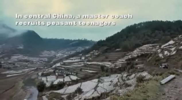
For location, we took inspiration from "China Heavyweight" by showcasing establishing shots of local areas the characters inhabited in order to familiarise the audience to how unique the setting of South London can be in terms of cultural and architectural diversity. This is similar to the fact that rural China would also be a niche setting to Western audiences, and thus follows the conventions of introducing location before narrative.


We took further influence from "China Heavyweight" in terms of using 'writerly' subtitling to encourage the audience to interpret important plot points through an open reading. Where the documentary pinpoints setting and activity, we replicated that.


CHALLENGE:
In terms of aesthetics, there were no post-production effects in order to achieve a realistic ‘feel’ like other documentaries, despite influence from the surrealist, 'dream-like' qualities of "The Act of Killing".
Sound was a significant factor in determining the mood established by our documentary. Similar texts usually have vocal-less non-diegetic soundtracks, and we incorporated two songs to demonstrate a progression in pace and mood of the trailer- the first one being a driving yet sparse and ambient piece of post-dubstep composition, the second a bass-heavy percussive number, with a jaunty swing to it and layered with emotive synthesizers and ‘trappy’ hats – as a way of engaging the audience’s emotion through dynamic shifts. Our choice of audio was influence by the type of music listened to by our teenage subjects, and so can another way for the audience to interact with characters by gaining a sense of the way they soundtrack their own lives. This auditory device can also be seen in the trailer “Dogtown and Z-Boys”, which layers a contemporary ‘surf rock’ soundtrack that would been popular at the time of the 1970s Californian skateboard culture subject matter.
For location, we took inspiration from "China Heavyweight" by showcasing establishing shots of local areas the characters inhabited in order to familiarise the audience to how unique the setting of South London can be in terms of cultural and architectural diversity. This is similar to the fact that rural China would also be a niche setting to Western audiences, and thus follows the conventions of introducing location before narrative.
We took further influence from "China Heavyweight" in terms of using 'writerly' subtitling to encourage the audience to interpret important plot points through an open reading. Where the documentary pinpoints setting and activity, we replicated that.
CHALLENGE:
We aimed to subvert
the audience’s expectations of representations of young people by exposing
their prejudices with a set of enigma codes presented during the first third of
the trailer. These included shots of young men in open spaces such as parks and
urban streets, dressed in stereotypically familiar ‘youth’ clothing such as
hoodies and snapbacks; deliberately worn to evoke connotations of wayward
lifestyles and youthful misconduct. In fact, with the suggestion of a
mysterious new ‘hobby’ young people were indulging in via on-screen titling – a
common technique in documentaries to introduce a story that is less clear in
narrative that a fictional piece – expecting some of the audience to assume it
was some sort of dubious drug-dealing venture.

The unique selling point of our film is the sheer bizarre nature of our subject matter. Other documentaries such as ‘Ping Pong’ (2012) focus on similarly non-mainstream topics, such as world table-tennis championships for the over-80s. Being a particularly niche subject perhaps works to its advantage, as it means the topic matter is not homogenised enough to attract a certain kind of following, such as men watching sports dramas more than women, but instead alternative enough to be open for anyone’s curious enjoyment.

Our open reading encourages audiences to become active discovering semiotic codes and thus making certain connections, in the vein a small-budget, independent film that intends to impress on the film-festival-going public's consciousness by enticing them with unexpected, 'edgy' subject matter. Furthermore, we chose to not explicitly outline narrative and oversaturate the audience's sense in the style of blockbuster marketing because as an independent documentary, "Back/Hand" requires more subtlety. Our text becomes considerably more writerly during the final montage as we encourage pondering about the fate of the characters, such as whether Chris will succeed as a professional tennis player or whether Robbo’s psychotic edge will destroy everyone else’s ambitions.

The unique selling point of our film is the sheer bizarre nature of our subject matter. Other documentaries such as ‘Ping Pong’ (2012) focus on similarly non-mainstream topics, such as world table-tennis championships for the over-80s. Being a particularly niche subject perhaps works to its advantage, as it means the topic matter is not homogenised enough to attract a certain kind of following, such as men watching sports dramas more than women, but instead alternative enough to be open for anyone’s curious enjoyment.
Our open reading encourages audiences to become active discovering semiotic codes and thus making certain connections, in the vein a small-budget, independent film that intends to impress on the film-festival-going public's consciousness by enticing them with unexpected, 'edgy' subject matter. Furthermore, we chose to not explicitly outline narrative and oversaturate the audience's sense in the style of blockbuster marketing because as an independent documentary, "Back/Hand" requires more subtlety. Our text becomes considerably more writerly during the final montage as we encourage pondering about the fate of the characters, such as whether Chris will succeed as a professional tennis player or whether Robbo’s psychotic edge will destroy everyone else’s ambitions.
The eventual reveal
that the hobby is ‘street’ tennis is only visual and is never explicitly
mentioned in a voice. However we hoped the use of semiotics such as tennis
courts, changing rooms and sports equipment would be enough evidence for the
audience to infer from the open-reading that this was film primarily about
sports, and the characters involved. Thus to provide some sort of understanding
of the social interactions within the piece, we provided anchorage with a
display of binary opposites in terms of the archetypal hero and a villain
characters. The hero appears at the beginning of the trailer – the only
character to speak directly to the camera – and is the main voiceover aside
from the villain, who behaves manically on camera and appears over voice-overs
identifying him as a dubious character. Furthermore, he is the only figure to
behave aggressively throughout the trailer, further anchoring the audience’s
preconception that he will be a volatile and dangerous character. Our
protagonist however, appears aspirational and playful, and hopefully encourages
the audience to take interest in his struggles and eventual outcome. The
opposing ideals presented from both characters – one wishing to be a sporting
champion, the other wanting to destroy everything in his wake – create a
conflict set-up that should interest the reader into discovering more about the
film. This device can be seen in documentary trailer “Undefeated”, where
characters with a variety of socially disruptive issues, such as deceased
parents or anger problems, are briefly introduced and an air of questioning is
left as to whether they will overcome their difficulties. A device used to
increase understanding of the characters is the voice-over, which can pose
questions and draw links, used for narrative effect in our film when one
character states, “I want to improve my game…this isn’t just a hobby anymore”,
which is able to develop the storyline. This can also be seen in “Undefeated”
which is narrated by the football coach protagonist as he weaves around a
plotline that suggests the team are heading towards a daunting championship
competition.


Introduction of character.


SL.
Friday, 21 March 2014

Thursday, 20 March 2014

Sunday, 16 March 2014
Wednesday, 15 January 2014
3rd Day of Filming - 18/01/14
Preparation: To prepare for our second and main day of filming, we created a Facebook group in which we advertised and invited friends to our day of filming and outlined their roles as extras. Some RSVP'd, many did not.
Before the arrival of most of our cast we set up the equipment and organised our travelling equipment bags, making sure to charge our two cameras as previous experience had taught us that technology has its definite limitations.
In order to to achieve maximum output in the shortest possible time schedule, it was agreed that each film-maker would film certain scenes separately, one having the tennis scenes and the other documenting social scenes. We organised the crew into two groups that would participate in either one of these filming sequences, the plan of action conveyed by a written presentation at the start of filming, along with some ideas of themes and characters.
Furthermore in this initial preparation stage, costume was important to establish. There was a descriptive 'street' dress code on the Facebook event, and the cast adhered to this to the best of their abilities. Knowing there might be some limitations, we supplied choice garments in order to maximise their 'street' look, as well as catering to the sports element with gym wear and tennis rackets. When all were assembled and dressed appropriately, we left for Dulwich Park.


Location: We chose Dulwich park because of its close proximity, sense of local community and availability of public facilities such as tennis courts. We were able to use these courts for our full advantage in shooting the sports scenes, as they matched our preconceived ideas of the slightly run-down, definitely not state-of-the-art or moneyed aesthetic. This was a nice contrast to the image of tennis as an exceedingly middle-class pursuit, played in spotless whites upon a freshly manicured astro-turf. Ours we gravelly, grey and bedraggled, but that added to its rough charm.
The social, 'human interest' scenes were shot in and around the Dulwich Picture Gallery grounds, which posses an timelessly beautiful and other-worldly quality that juxtaposed with our motley crew of extras milling about it.
Filming: A key element of filming was the use of candid camera; as a documentary we want our subjects to act as naturally as possible, particularly in a situation they may not be wholly comfortable in, such as filming. Thus many of our 'socialising' shots were recorded unbeknownst to the subjects, and I feel this was pivotal in securing the feeling naturalness and familiarity 'Backhand' achieves. Many of the cast were never even given direct instructions on how to act, and so instead made conversation with their friends to pass the time, yet unknowing using our time well.
SL.
Before the arrival of most of our cast we set up the equipment and organised our travelling equipment bags, making sure to charge our two cameras as previous experience had taught us that technology has its definite limitations.
In order to to achieve maximum output in the shortest possible time schedule, it was agreed that each film-maker would film certain scenes separately, one having the tennis scenes and the other documenting social scenes. We organised the crew into two groups that would participate in either one of these filming sequences, the plan of action conveyed by a written presentation at the start of filming, along with some ideas of themes and characters.
Furthermore in this initial preparation stage, costume was important to establish. There was a descriptive 'street' dress code on the Facebook event, and the cast adhered to this to the best of their abilities. Knowing there might be some limitations, we supplied choice garments in order to maximise their 'street' look, as well as catering to the sports element with gym wear and tennis rackets. When all were assembled and dressed appropriately, we left for Dulwich Park.
Location: We chose Dulwich park because of its close proximity, sense of local community and availability of public facilities such as tennis courts. We were able to use these courts for our full advantage in shooting the sports scenes, as they matched our preconceived ideas of the slightly run-down, definitely not state-of-the-art or moneyed aesthetic. This was a nice contrast to the image of tennis as an exceedingly middle-class pursuit, played in spotless whites upon a freshly manicured astro-turf. Ours we gravelly, grey and bedraggled, but that added to its rough charm.
The social, 'human interest' scenes were shot in and around the Dulwich Picture Gallery grounds, which posses an timelessly beautiful and other-worldly quality that juxtaposed with our motley crew of extras milling about it.
Filming: A key element of filming was the use of candid camera; as a documentary we want our subjects to act as naturally as possible, particularly in a situation they may not be wholly comfortable in, such as filming. Thus many of our 'socialising' shots were recorded unbeknownst to the subjects, and I feel this was pivotal in securing the feeling naturalness and familiarity 'Backhand' achieves. Many of the cast were never even given direct instructions on how to act, and so instead made conversation with their friends to pass the time, yet unknowing using our time well.
SL.
Tuesday, 14 January 2014
2nd Day of Filming - 06/01/14
This day of filming was necessary in capturing location shots and establishing background for 'Backhand', as opposed to excessive character study. In fact, we only had one extra who took on the role of "tennis racket dealer".
The day started off on a slow note; charging cameras and assembling tripods. We then transferred this equipment to Dulwich Park.
Initially, long-distance panning shots were taken of the waterfront, tennis courts and the luscious green fields, intended to be used at the beginning of our trailer.
We also shot the tennis racket dealer exchange scene that could be used as our teaser trailer. This sequence sums up the interchangeable similarities between the conventions of the 'street' youth world and the street tennis world we aim to present.
SL.
The day started off on a slow note; charging cameras and assembling tripods. We then transferred this equipment to Dulwich Park.
Initially, long-distance panning shots were taken of the waterfront, tennis courts and the luscious green fields, intended to be used at the beginning of our trailer.
We also shot the tennis racket dealer exchange scene that could be used as our teaser trailer. This sequence sums up the interchangeable similarities between the conventions of the 'street' youth world and the street tennis world we aim to present.
SL.
Monday, 13 January 2014
1st Day of Filming - 20/12/13
All the cast and crew were arranged to arrive at my house for 11 AM, although admittedly we were not ready to film by at least midday. We first checked that all of our filming equipment was in order, checking the boom, directional microphone, camera, tripod, dolly wheels, micro-track and all the appropriate headphones and cables. After all of this was done we had to make sure that we had effectively collated all the necessary provisions, costumes and props for the scenes we hoped to shoot. This all consisted mainly of hats, coats and tennis rackets. Our actors arrived appropriately dressed for the shoot but also took to some costume enhancements.
Once we were ready we made our way towards the estate in Dulwich which we had planned to use as our first location. The walk was not too long and we were able to share the load of the equipment between many hands so one could hardly describe it as gruelling. Upon arrival at the estate, we set up our first shot which is of Chris (Tom Hemington) standing beneath an underpass giving an interview on how he is struggling and so are many of his peers in the high pressure situation that they have found themselves in. Unfortunately an irate woman made us move from that particular area of public land and so we resumed filming soon after across the road, continuing on with Chris' interview. After this we filmed Robbo's (James Wilson) interview and then Carl's (Ranya El Refaey), both fairly near by due to convenience but also due to the area fitting our style and tone so seamlessly.
We continued to experiment with our character depictions, particularly Chris, for example switching from the initial, full-frontal camera long-shot we were using for his interview in the underpass to a side-on mid-shot as he leant against a brick wall, eventually zooming in for close-up. This felt like we were exploring multiple 'sides' of our character, as well as getting to grips with camera angling on a practical level.
During these interviews we used to boom pole to help us record sound on the micro-track, and having previously never used such advanced sound equipment we had to repeat several shots over in order make sure we had completed the task. Issues with wind interference were corrected.
CS & SL.
Friday, 3 January 2014
Film Title: Plan

FONT
The font used for this title is HeadLineA found on Final Cut Pro. The stylisation of the font reflects duality of the themes presented in the film, with the juxtaposition of lower and upper case fonts, and their contrasting spacing and size.
NAME
According to Wikipedia, a backhand move in tennis: "Because the player's dominant hand "pulls" into the shot, the backhand generally lacks the power and consistency of the forehand, and is usually considered more difficult to master. However, the two-handed backhand provides more stability and power for the shot, and is increasingly used in the modern game. Beginner and club-level players often have difficulty hitting a backhand, and junior players may have trouble making the shot if they are not strong enough to hit it. Many advanced players still have a significantly better forehand than backhand, and many strategies in tennis aim to exploit this weakness."
The idea of backhand acts as a metaphor, as the kids are not professional tennis players in any capacity, although some may secretly dream to be. In relation to their background, they are disadvantaged as players, and there are more struggles when it comes to mastering to the game, but if one of them was to overcome these obstacles and master the game, then it would be considered a triumph. In the end, many of the kids are on different paths, but for some tennis may be the one to follow.
SL.
Ident Influences


They are a New York-based studio producing independent films and documentaries and, according to the Zeitgeist website: "Bringing quality foreign and independent feature films and documentaries to American screens since 1988". Six Zeitgeist films have been nominated for Academy Awards and one (Nowhere In Africa) has won the Academy Award for Best Foreign Language Film. Their films have been honored by festivals throughout the world with Grand Prizes at Cannes, Berlin, Sundance and IFDA in Amsterdam. In an ideal world we would model our own production company on Zeitgeist.
The style of their ident has a more 'retro' feel than an overly technological one, with its handwriting-style design, which gives the impression that they are a laid-back independent studio, producing films and documentaries similar to ours.
The style of their ident has a more 'retro' feel than an overly technological one, with its handwriting-style design, which gives the impression that they are a laid-back independent studio, producing films and documentaries similar to ours.
('Examined Life' Documentary Produced by Zeitgest)


SL.
Monday, 16 December 2013
Graphics: Planning

For end credits, we would like a dense cluster of the words to present the information, because following the dramatic montage of the trailer's third act, the credits should appear on screen in a 'hard and fast' style that delivers all the essential information in one go. Our trailer will probably start off fairly ambient and visuals based, but will gradually become more concise as it crosses over into Act 2 and Act 3 of the Three Act Structure of the trailer (the establishment of conflict and the final montage), and so the clear, block credits will be the final burst of information following the title shot.

Film Title: Influences

Inspiration can be drawn from Manhunt: The Search for Bin Laden, with its separating the stylisation of two sections of one word; this places emphasis on its meaning and leads the audience to question why the title was chosen and how it is important. In this case, 'manhunt' is familiar term with sinister connotations, but in the case the hunted is the 'evil' entity, not the hunter, thereby subverting expectations of what the title implies. Furthermore, the title is so basic and literal in its meaning that it quite simple to understand its premise, and although it may be a touch heavy-handed at least it is simple and direct, avoiding anything complex and pretentious.
The spacing of the letters is relevant here because the 'Man' in question - Bin Laden - is one obvious issue the CIA are facing in their counter-terrorist activity, present in a tightly-lettered, simplistic form, whilst the 'Hunt' is the bigger, longer process that takes years to resolve, conveyed with the letters spread out across the screen/page.
Sunday, 8 December 2013
Tuesday, 3 December 2013
Graphics: Influences

'The Act of Killing' has preferably simple and clean font, that was reported to be visually striking by our focus group. The equal spacing between the letters makes the title command the width of the screen and gives it a strong impact. As opposed to something more directional and perhaps artistic, I feel that documentaries benefit from having less flamboyant font because they are focused on telling a real life, investigative and analytical piece, and the graphics should reflect this.

Further inspiration comes from Scandinavian brand

Which has a 'no-frills', simple but effective font, emphasizing the point I made earlier.
In terms of real examples, 2007 'Control' has similar themes of intertwining struggle and success, as well as being similar to a documentary because it is a biographical film, and its font reflects the style we would like. Furthermore, I like how the grey fade gives it a shadowy depth, that is similar to its neo-noir style.

The image below shows a similar example of graphics we would hope to use.


In the example of the "Up in the Air" the fonts is leaning a bit too much towards a 'comic sans' direction that we don't want, but it has a clear spacing on different parts of the screen that highlight establishing shots of the background, which allude to the idea of the central themes being about flying, travel and restlessness. Ideas of restlessness will also play a part in our film, since the central characters are striving to make a transition from their current lives towards their sporting goals, and this suits the shifting structure of the credits and the dynamics against the background.
SL.
Monday, 2 December 2013
Film Poster Research

Colour & Tone = Upon first glance, this poster is aesthetically striking because of the contrast of the moody black and grey background lit up by the almost violently bright orange flame. This poster suggests to me that this is a film whose subject matter is dark and gritty, with the explosion of fire against grey skies connoting themes of conflict and perhaps destruction 'overhead'. Alhough our films subject is not as grim and hopeless as "There Will Be Blood", I like the way colour suggests a variety of (at times) contrasting themes.
Imagery = Character is established in the left hand side of the poster (immediately influencing our gaze upon the order of the images), and the fact that he has back turned creates a sense of mystery around the individual. Furthermore his hunched stance upon the chair asks contrasting questions; is he worn out and withdrawn from the chaos he sees before him, or is he about to leap into action. Or both?
Text & Font = The main titles are in the style of calligraphy, and this automatically suggests that this is period film, so thus establishing genre. Our film's font will proabably be a bit more ambigous but still try to deliver a simple message that it is, for example, not a chick flick. There are minimal credits, only the main actor and the writer/director, and our film will probably have a similar lay out because it is a documentary, and so relies less on big name stars, and more upon the prestige it recieves, as highlighted by the film awards placed centrally on the poster of "There Will Be Blood".

Colour & Tone = The obvious inference to make about the colour palette is that the bright red text is symbol of spilt blood and other themes of violence and crime. Set against the conrasting black background, it is strong and striking as aposter, with a dark and sinister to feel to it. However our film is not going to be 'sinister', but I like the way you can immediately tell its genre as a thriller, and is bold in its motives.
Imagery & Layout = I particularly like this layout for our film poster because the main image of the prison-tattoed head is not only visually impressive, but motivates the viewer to questions the themes and ideas it represents. For example, the appearance of the tattoes alludes to the idea of criminal gangs and wrong doing, especially with reference to the provocative tagline 'every sin leaves a mark'. A suit sleeve is visible, as well as an expensive watch, suggesting that it is centered arond high-stakes organised crime rather than just any criminal gang, and definitely a reference to the Russian Mafia with the appearance of a cyrillic tattoo. The hands are distinctly masculine, and this could be a reference to the kind of audience and genre this film is representing, which is mostly males watching crime and action thrillers.
However, to stop it from being a bit too obscure, some more visuals are added in the form of character action headshots beneath it, just above the title. This gives the poster more depth by not only well establishing two main characters but also have them in alarmed and urget poses, connoting that conflict is going to be everpresent in this fast pace film.
SL.
Wednesday, 27 November 2013
Actors
 Chris - Tom Hemington
Tom has a kind face, making him approachable, but is still stocky enough so that he can appear intimidating. He has a soothing voice and calming demeanour and is able to carry himself with the same self assurance that we wanted to convey with Chris. Tom is also effective at conveying a sense of total control over his peers, a quality that is perfectly suited to the character of Chris. Toms accent will not need to be too heavily altered either as his voice will be tampered with in post production.
 Robbo - James Wilson
James is very good at creating an intimidating and somehwat volatile seeming character through his use of posture and gait. He will be able to use his voice in such a way as to give Robbo's text a sense of being ominous. He is not extremely tall or well built but this is suited to our needs as we wanted Robbo to appear more scrappy and sneaky than over bearing and imposing. Obviously his presence on screen will be unnerving to the audience but this will be acheived through a demeanour of surliness. James will not have to worry too much abouthis appearance as the costume provided will help him to build his character more easily, giving him an idea of where to build from.

Carl - Ranya El Refaey
Ranya is extremely kind and warm hearted and brings a sense of calm to any situation. This air that she carries with her is perfectly suited to the characer of Carl, who acts as a mediator between Robbo and Chris. She has a soft and soothing voice and a kind face which makes her approachable and likeable. She also has a lovely smile which would warm the heart of any hardened veteran of the streets. Carl went to school with Chris and Robbo and so refers to them and acts around them with a sense of calm and control that is not acheived by any other character in the film. As well as all of this, Ranya is Arabic, helping to bring some much needed diversity to the cast.
CS.
Tuesday, 26 November 2013


Friday, 15 November 2013
Subscribe to:
Posts (Atom)